Buen Día Brows is a beauty and esthetician brand originally based in Southern California that specializes in eyebrows.
Diana approached me to craft the Brand Identity and Systems for her new business. Working with Diana was great as she had a solid idea of what she was looking for which started with several keywords.
Tropical | Boho | Mustard | Textures
After our first discussion we prepared a moodboard that consisted of some examples logos and marks Diana liked. I added a few existing beauty and skincare brands to pull inspiration from and start getting Diana in the mindset of what her brand could look like at the end of the process.
Pulling from existing examples I added a handful of other keywords to my designs to guide the process. Knowing Diana’s family hailed from Colombia and the Dominican Republic I pulled in influences from Latin culture into the design process as well.
Light | Clean | Warm | Latin
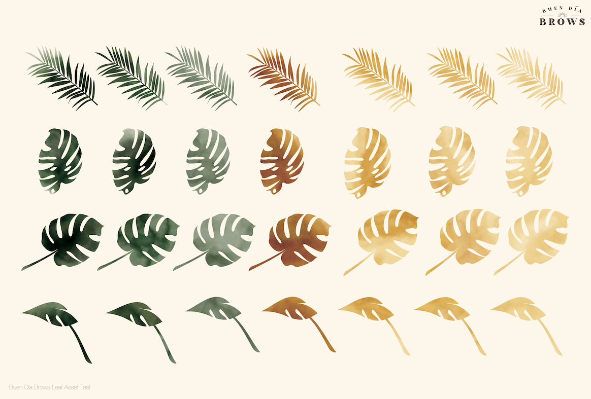
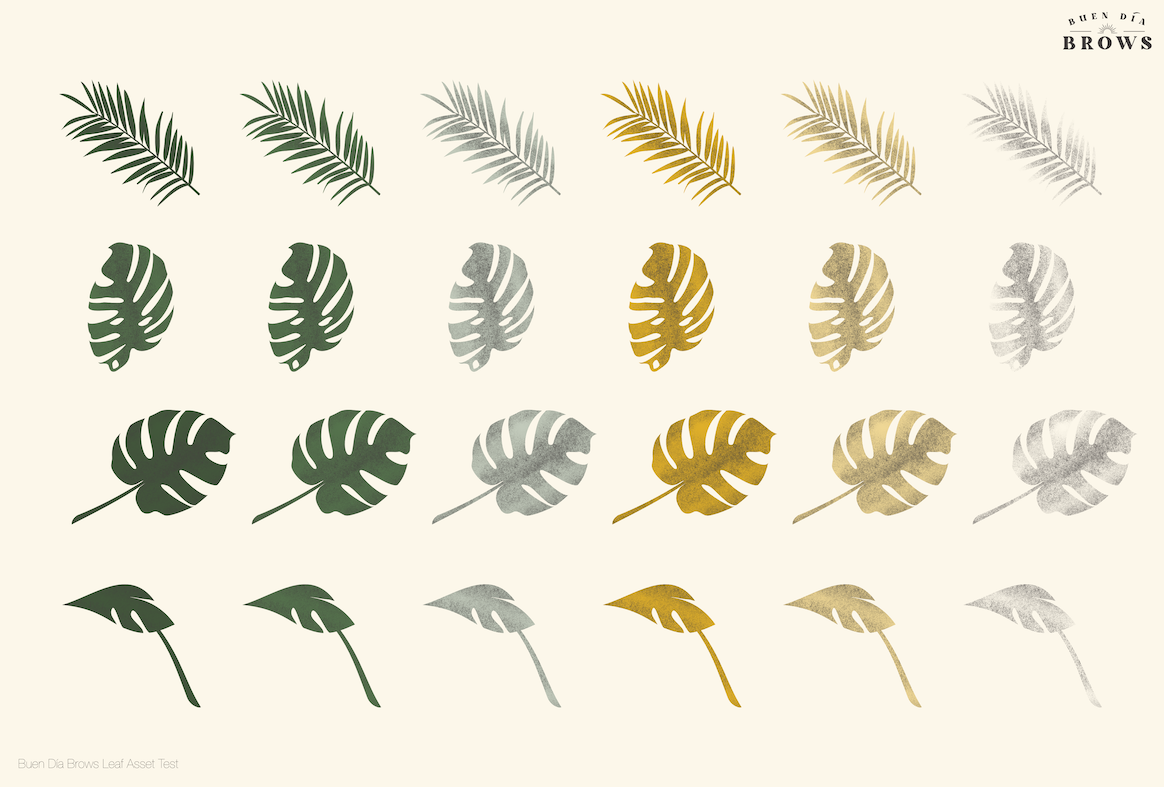
Early in the process we landed on using tropical leaves (philodendrons, monstera, &c.) as ornaments and decoration throughout the identity and, more specifically, on the back of the business cards. Instead of photography we decided on clean line drawings of the various tropical leaves with a texture.
Diana was presented with two options each within the already determined brand palette.
A dark, textured grain that felt like stippling or brush flecks.
Deep watercolor textures.
While the watercolors were beautiful, worked well on their own and fit the brief perfectly, ultimately we opted to go with the first option. Throughout our explorations the gritty texture of the grain proved to read better at all sizes.
During our exploration phase, Diana knew she wanted to focus on a Wordmark. Something that felt warm and personal but also professional; combining her Hispanic roots and wanting to stand out in the.

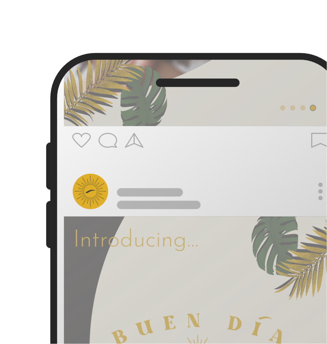
Keeping in mind that this mark would likely be used in multiple applications, I provided an alternate that would allow the main mark to be scalable. This scaled down mark could be used in Website Favicons, Social Profile Avatars, or anywhere that would be too small for the type to be legible.
Providing a scalable mark like this provides a method to keep the brand visible to consumers but still reads well regardless of how small or how far away the reader is from the mark.
Now that we had the major elements of the Brand’s Identity Systems locked in, it was time to collate everything and get them in place.
The primary collateral Diana had requested was a simple business card. With this card I had the challenge of combining each element of the Identity we had developed up to this point and of course making a design that is both attractive but utilitarian.