 |||
|||
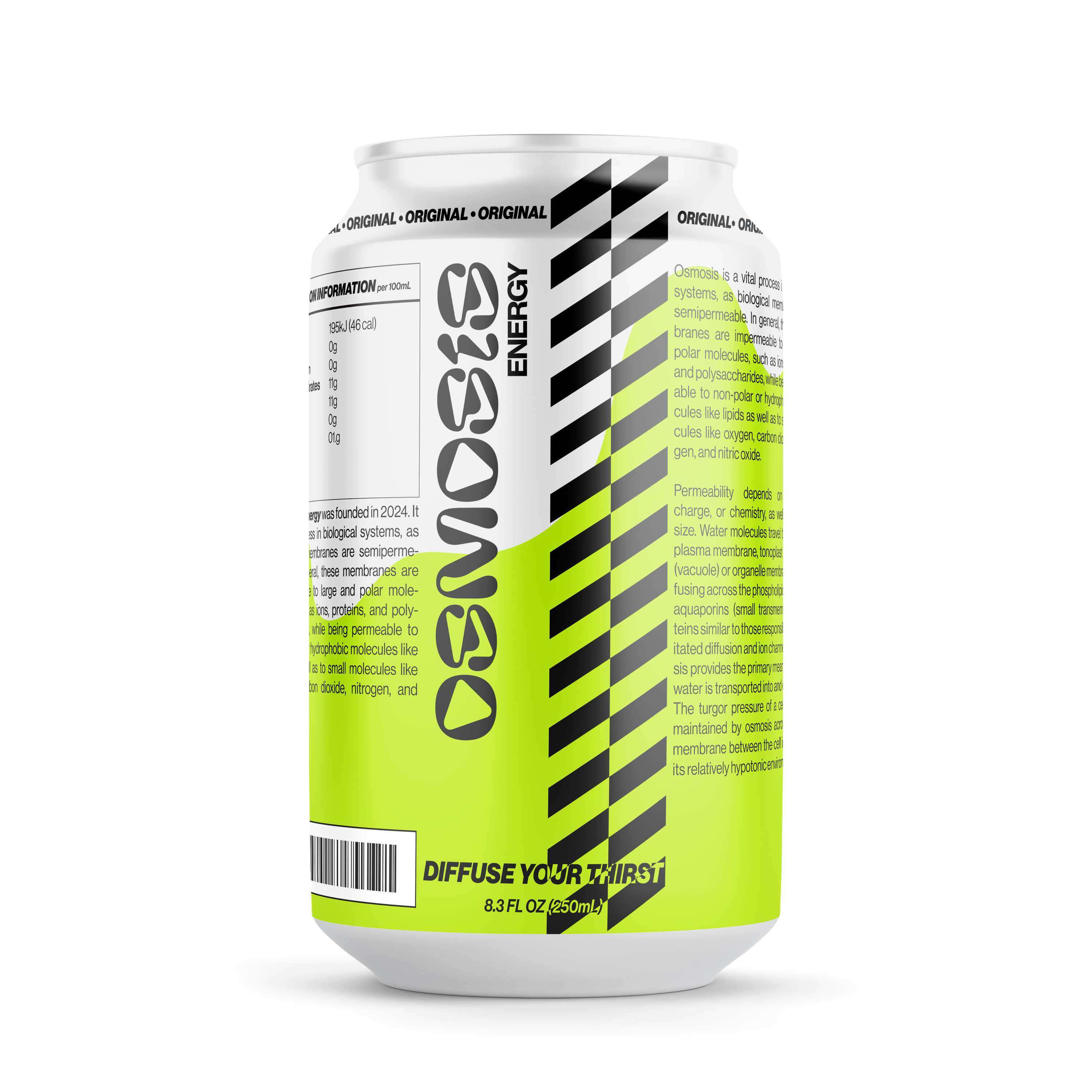
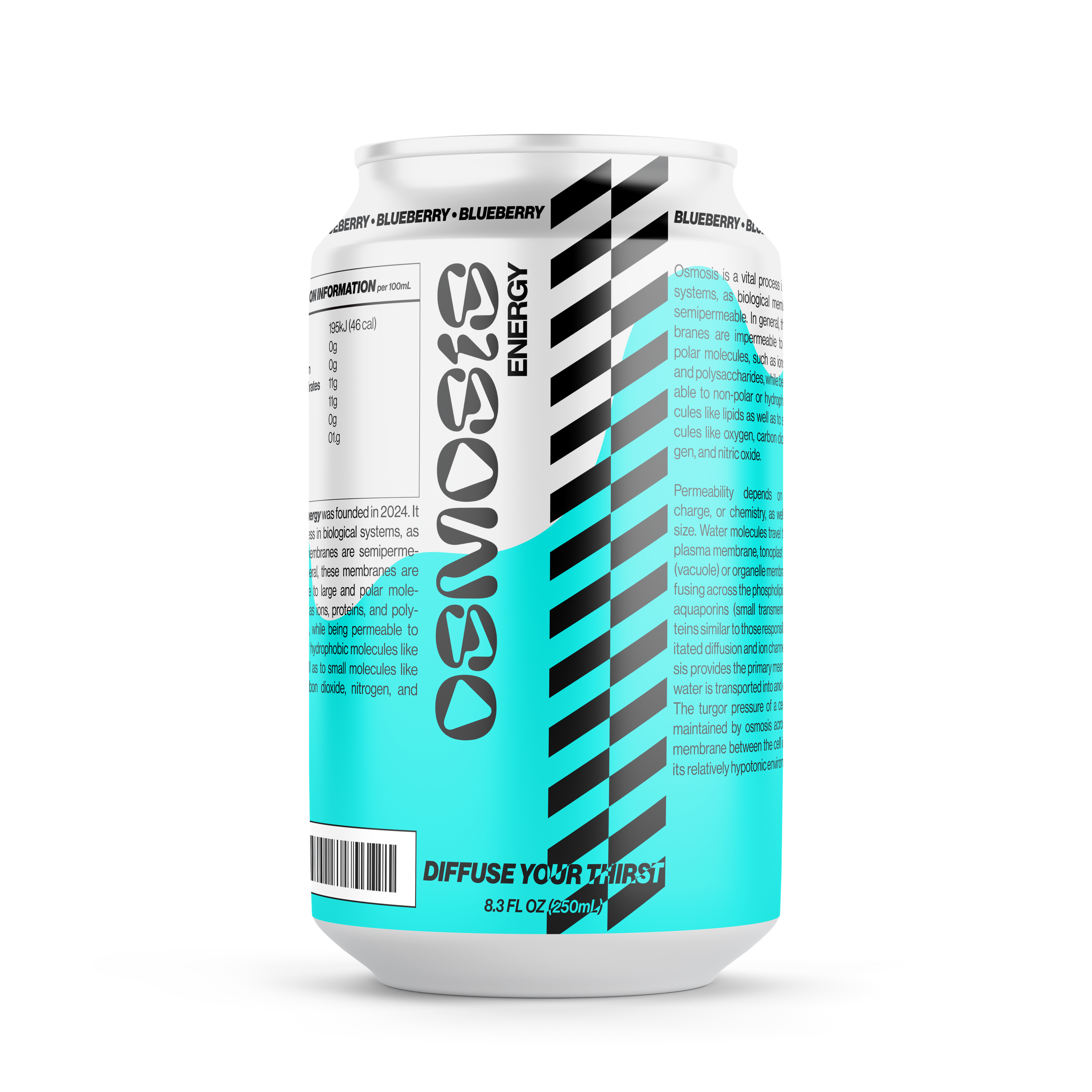
Osmosis Energy is a fictitious beverage brand based designed for an esports and game enthusiast audience.
The thought was to create a brand for a company that would cater to those that spend their nights (and early mornings) gaming. Be it video games, tabletop games, whatever kept you up into the wee hours that might need a spike of energy.
Technical Design | Bright Colors | Acid Textures
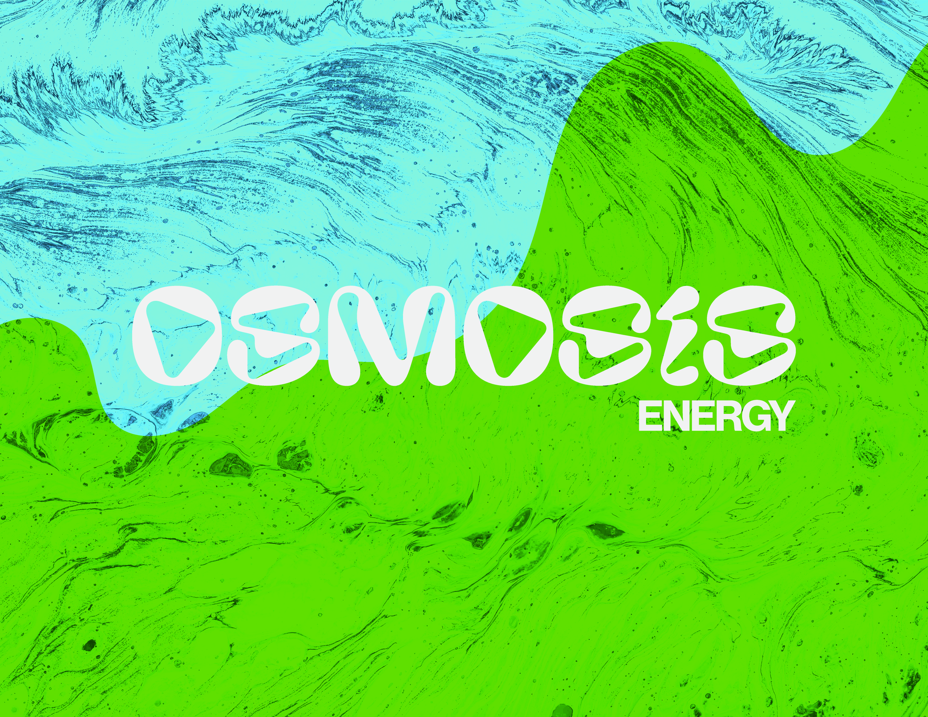
After coming up with the name and tagline (”Diffuse Your Thirst”) based on the diffusion of fluids, the next step was to craft what Osmosis Energy would look like. The first starting point was to find a word mark that fit. As osmosis is a process that involves water, selecting a display typeface that felt like it was poured onto the page seemed the perfect match.
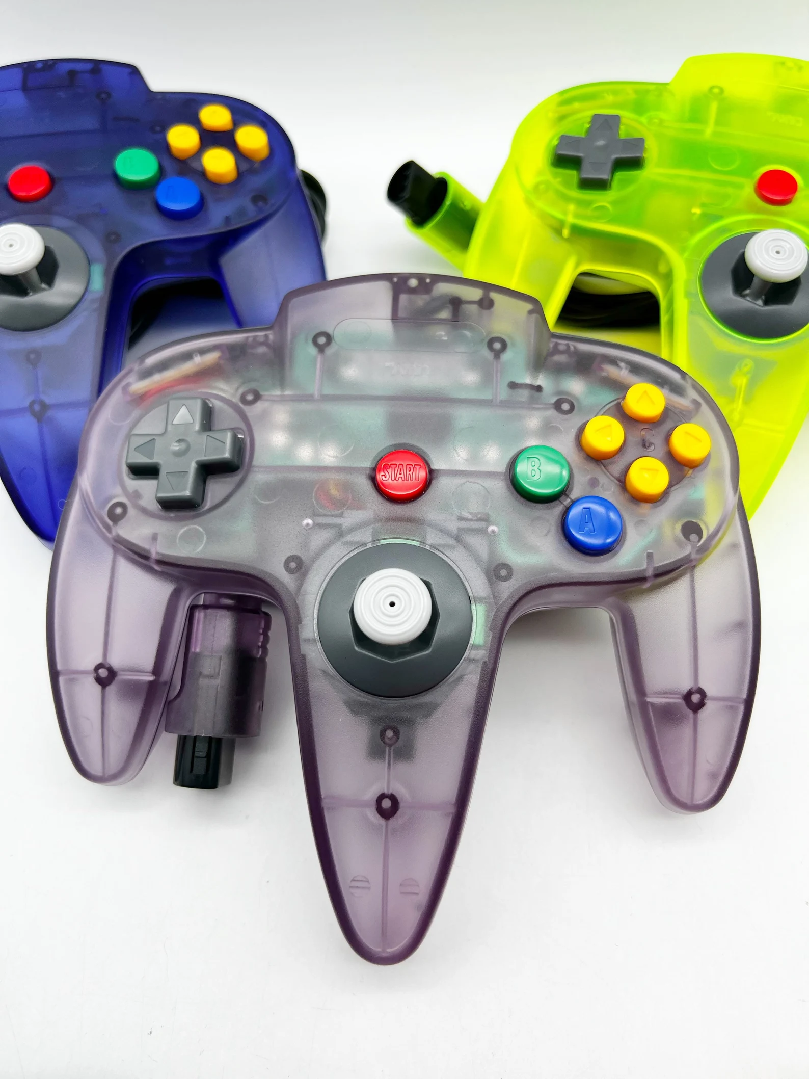
Thinking back to the bright and colorful plastics of game controllers, it seemed obvious to keep with that tradition. Using a minimal pallet, focused on bold colors, the next step was…
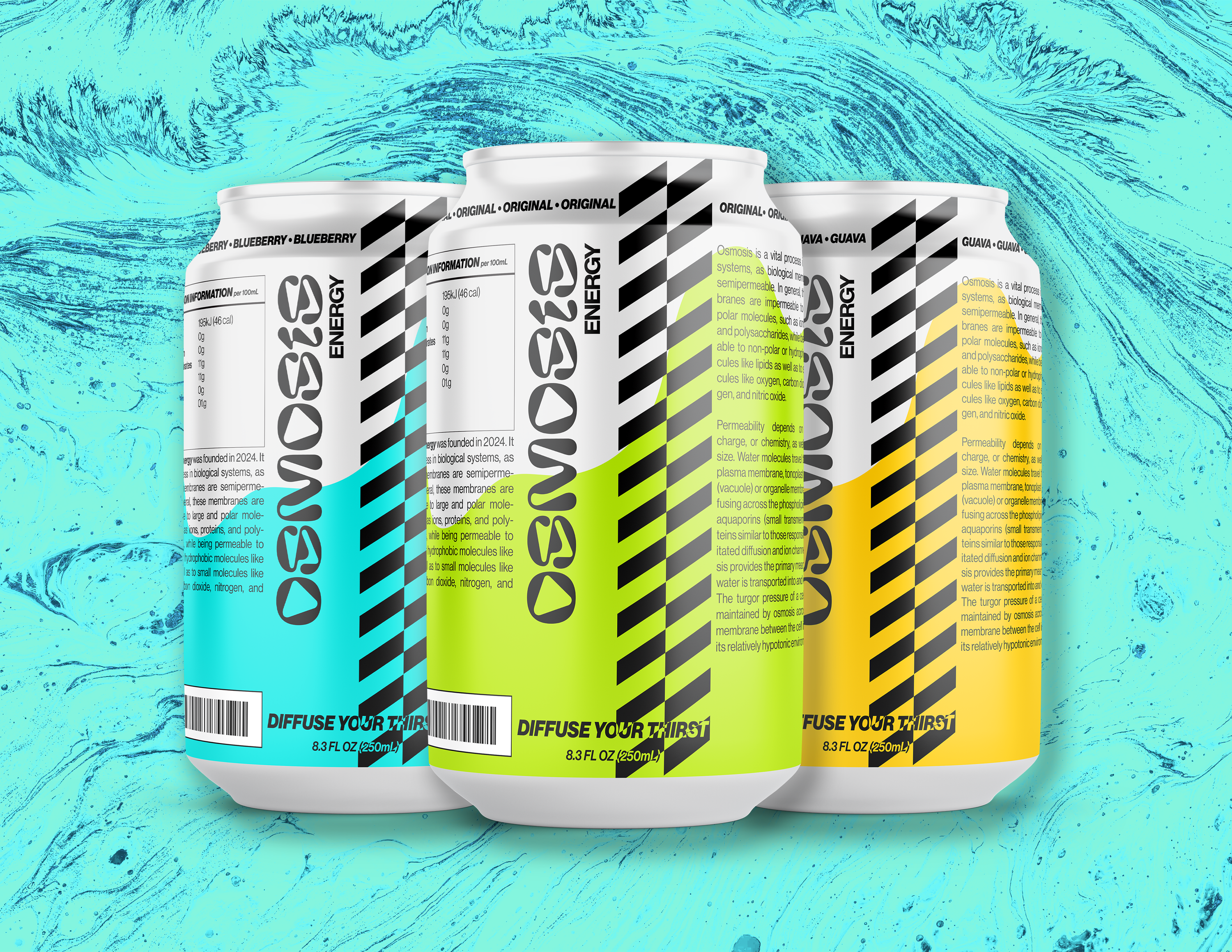
Finally, combining it all. Now that we had a look, typography, brand colors, the final step was implementing and seeing what that would look like on packaging and products. Being an energy drink, aluminum cans seemed to be the best medium to implement the branding for Osmosis.
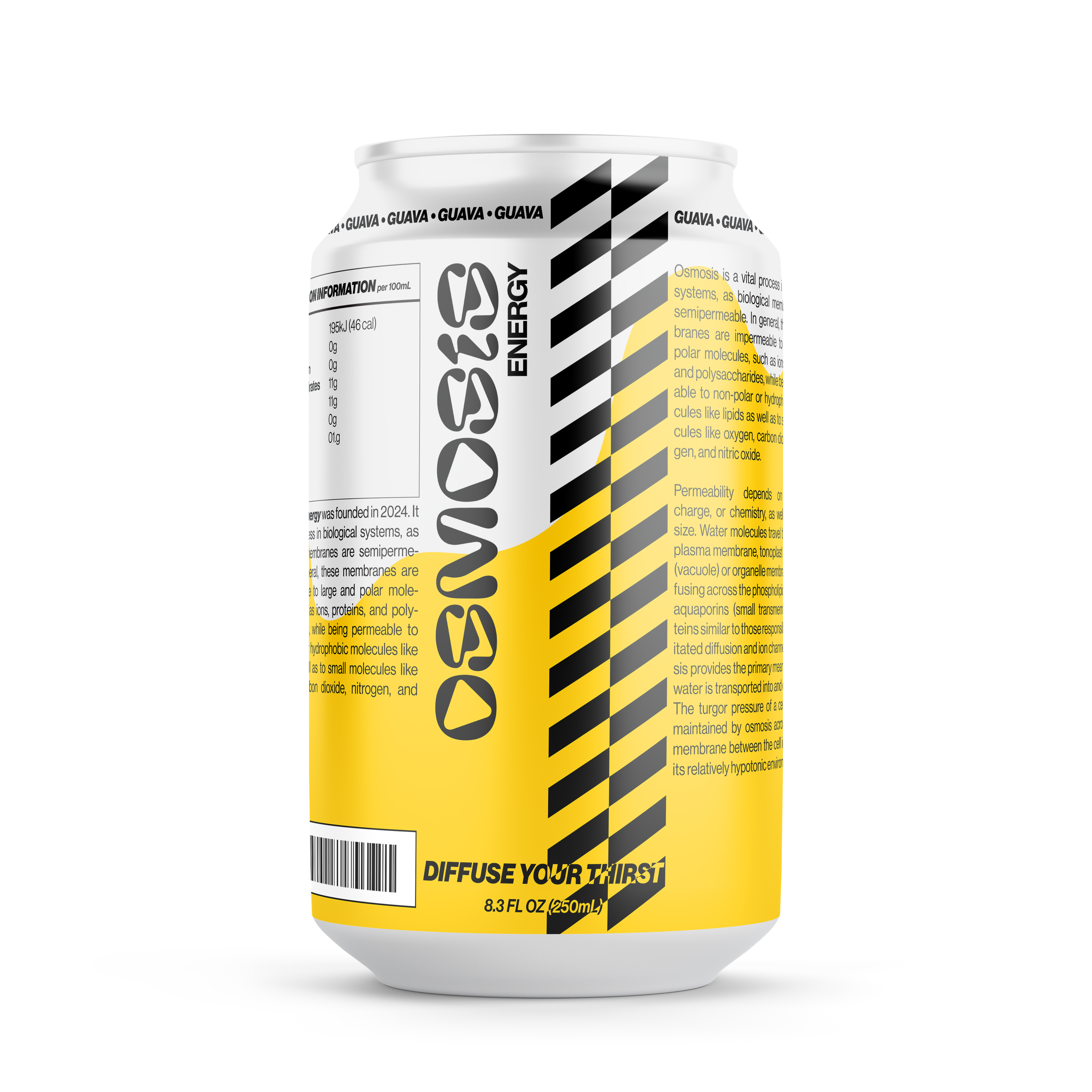
Each flavor would be identified by its own “controller” color along with a quick tagline along the top of the can.