 |||
|||
Sonic Trip Sound (STS) was born from the need to create a fictional record label for a series of mockups made for a 30-Day Design Challenge.
Initially it was just a simple, single geometric shape mirroring the design for a jazz album. But at first each element was spread out and disparate without any meaning or cohesion.
For the next piece in the 30-Day Challenge, I wanted to go with something more in the style of instrumental hip-hop; something you might find in a dusty crate at the back of a thrift shop or musty music shop. From this Crate Diggin’ for Ma was born.
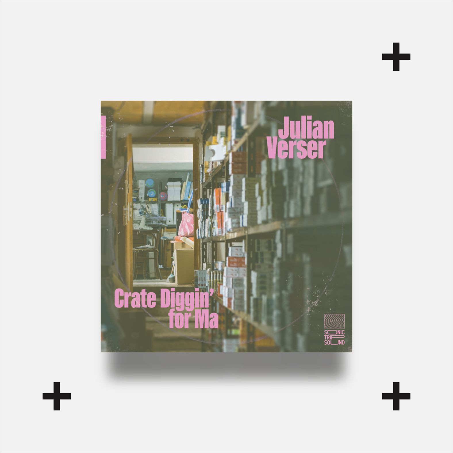
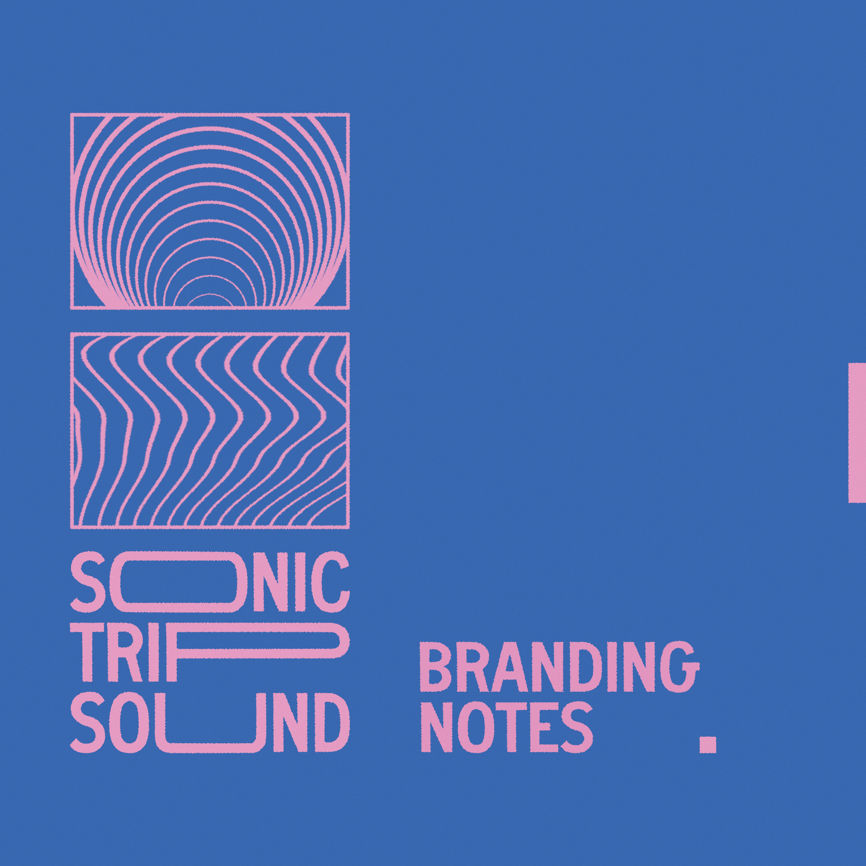
Here we see the first iteration of the STS Logomark in action. But it still didn’t feel as though it was living up to its full potential.
The current iteration worked well for conceptual albums, jazz, and hip-hop. Those two genres often have a lot of overlap in their approach, style, and even audience so, while the word mark was appropriate, it felt like it limited the brand.
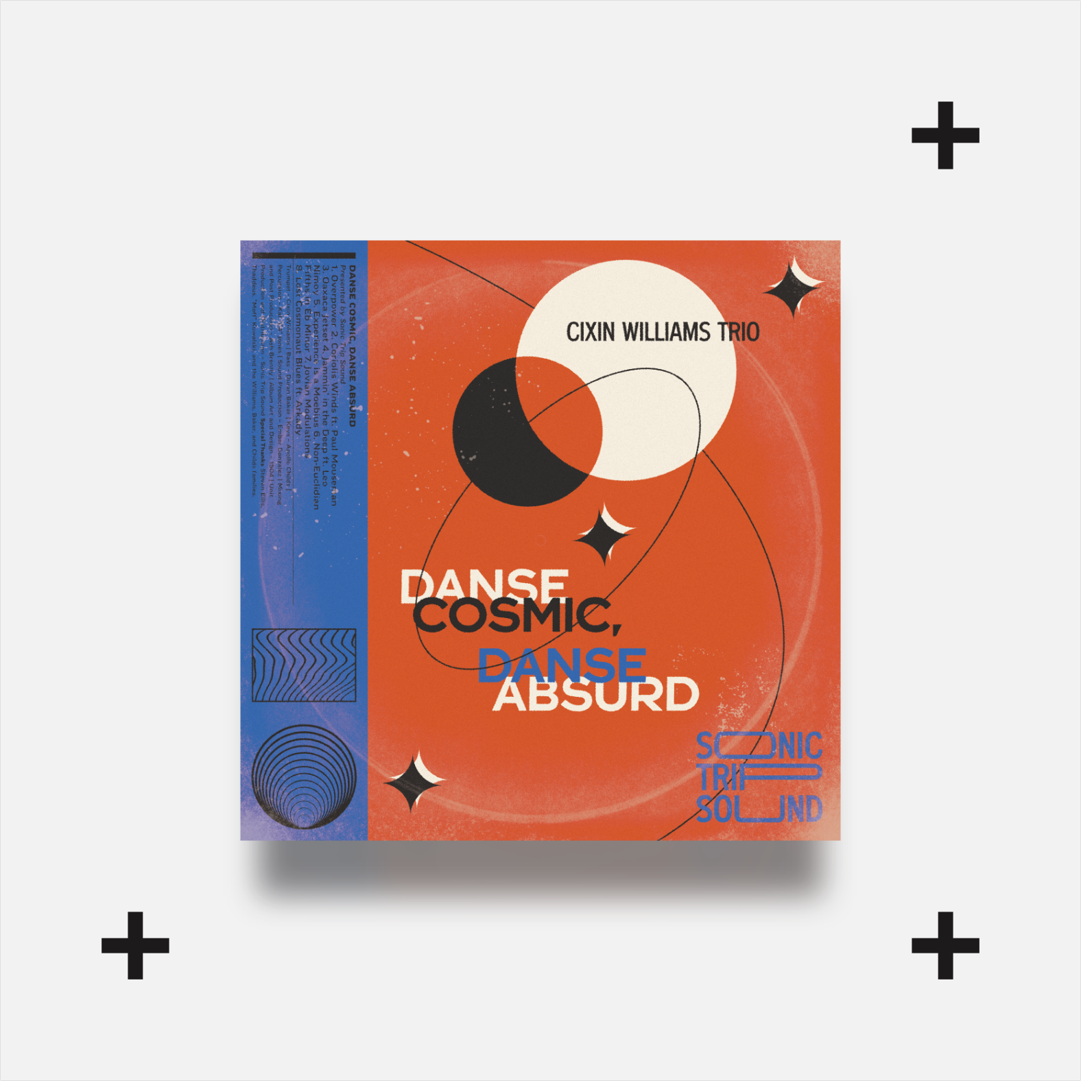
So I began to explore options and variations from the first designs seen in the Danse Cosmic mockup.
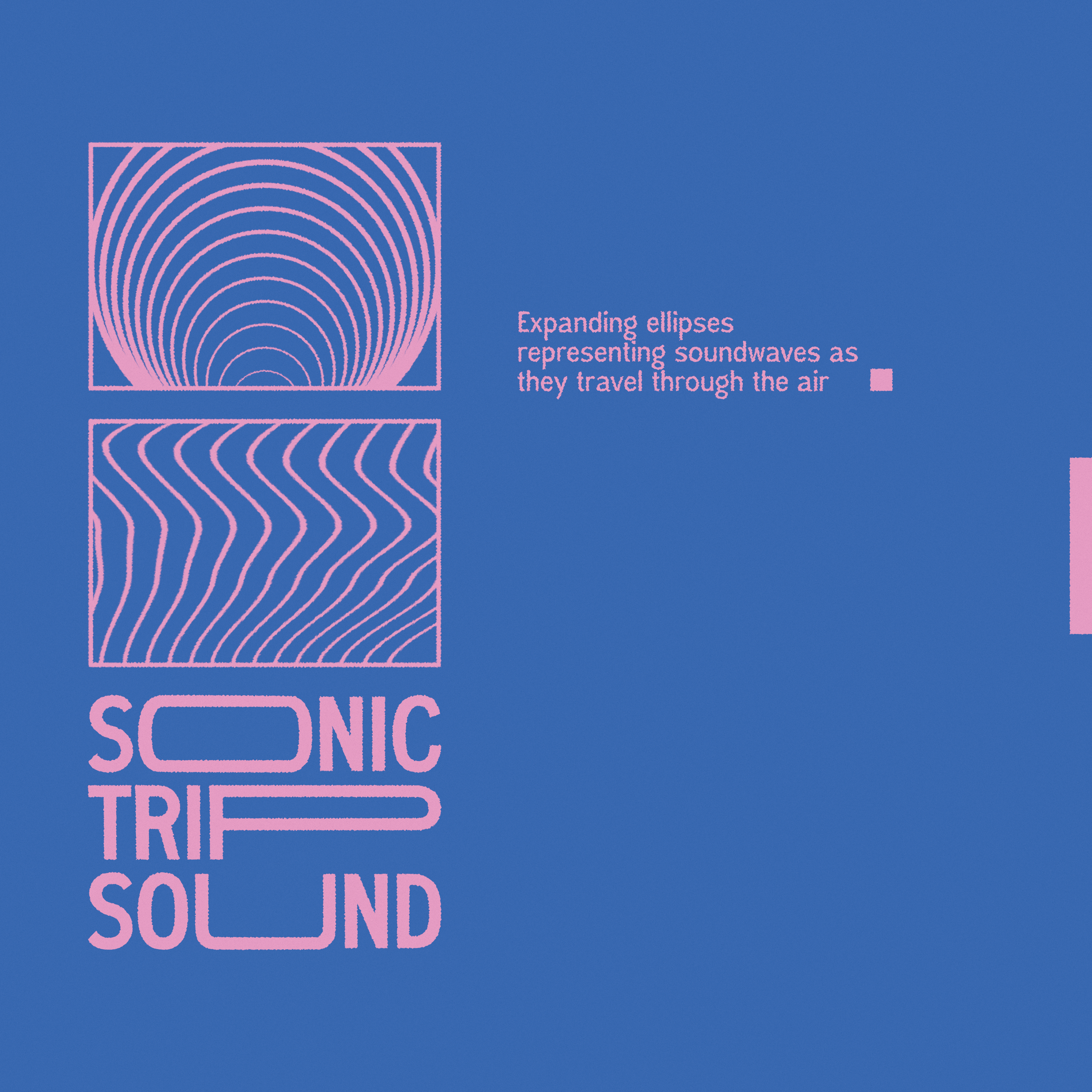
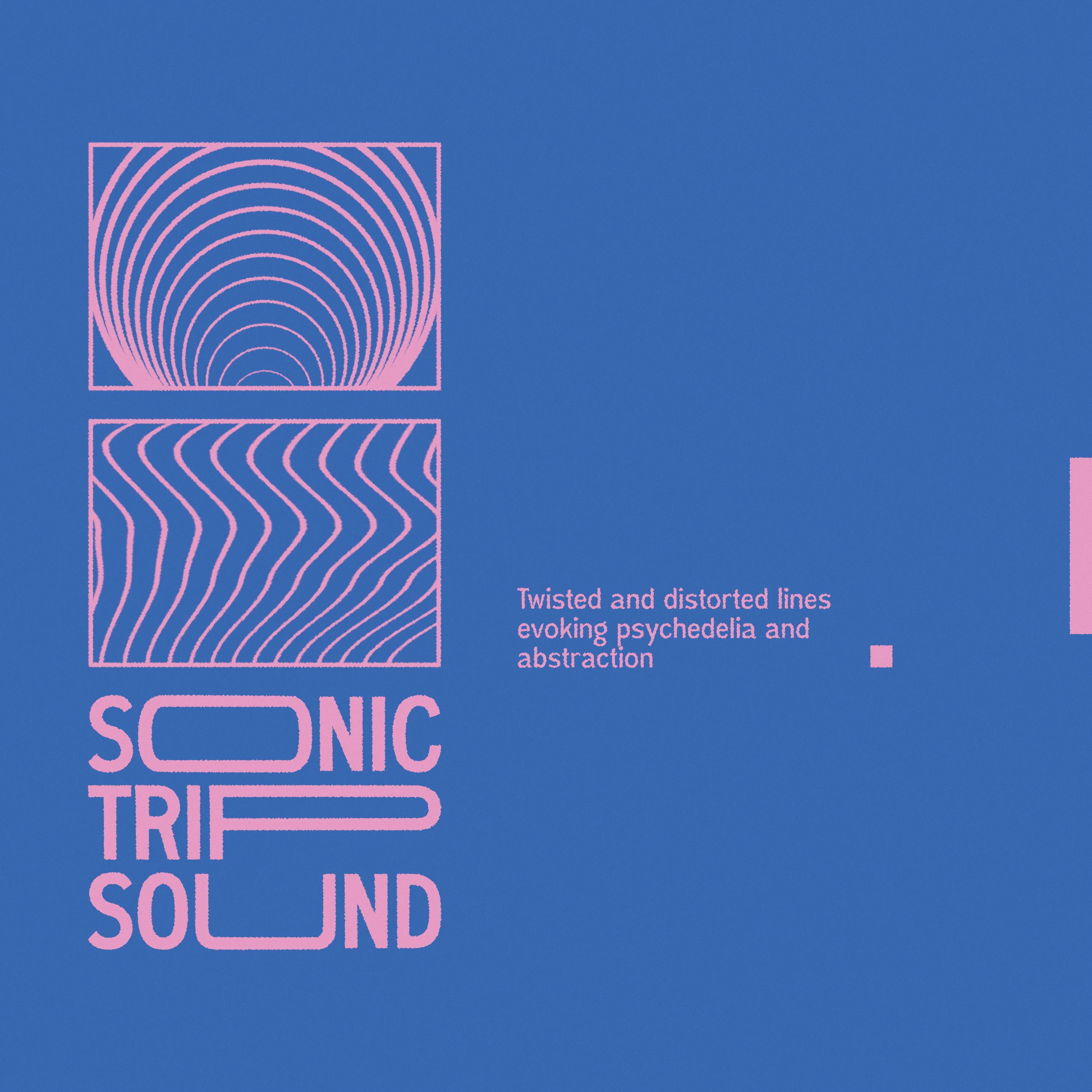
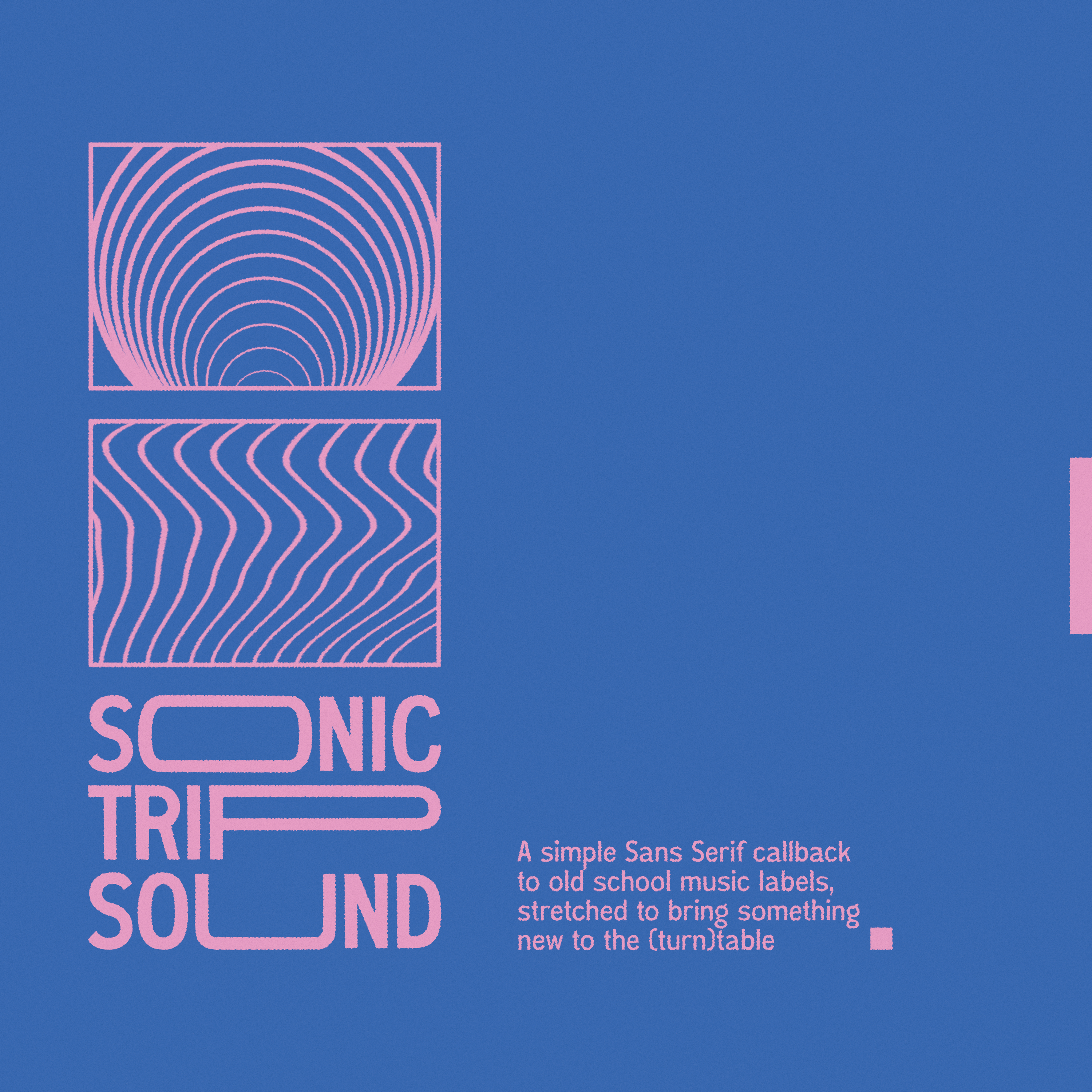
With this I also began to break down and explore the intent behind each shape and element of the logomark.
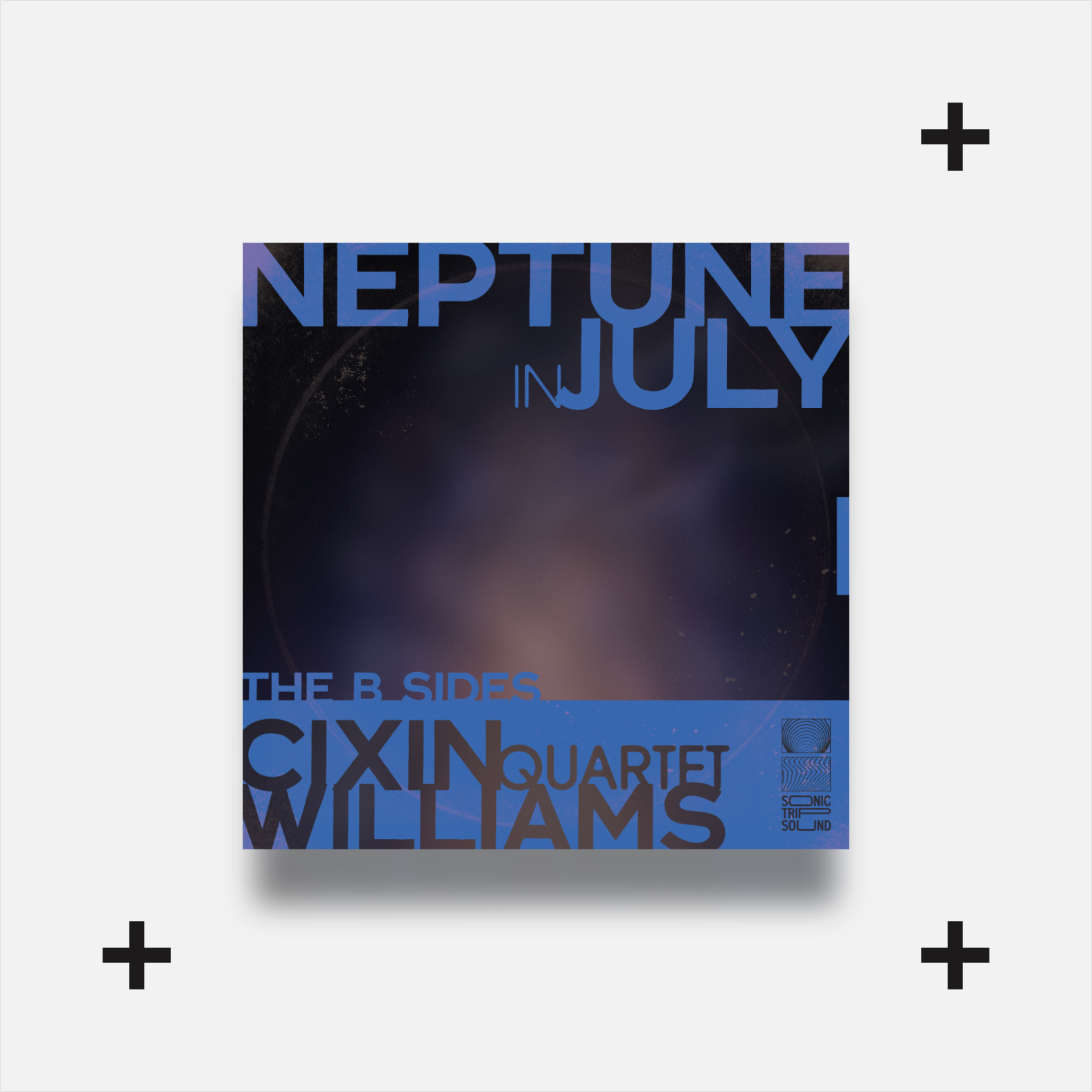
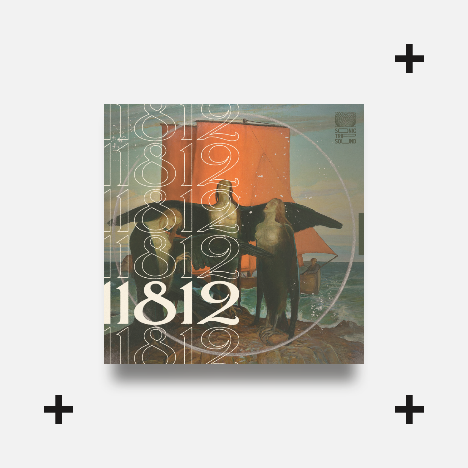
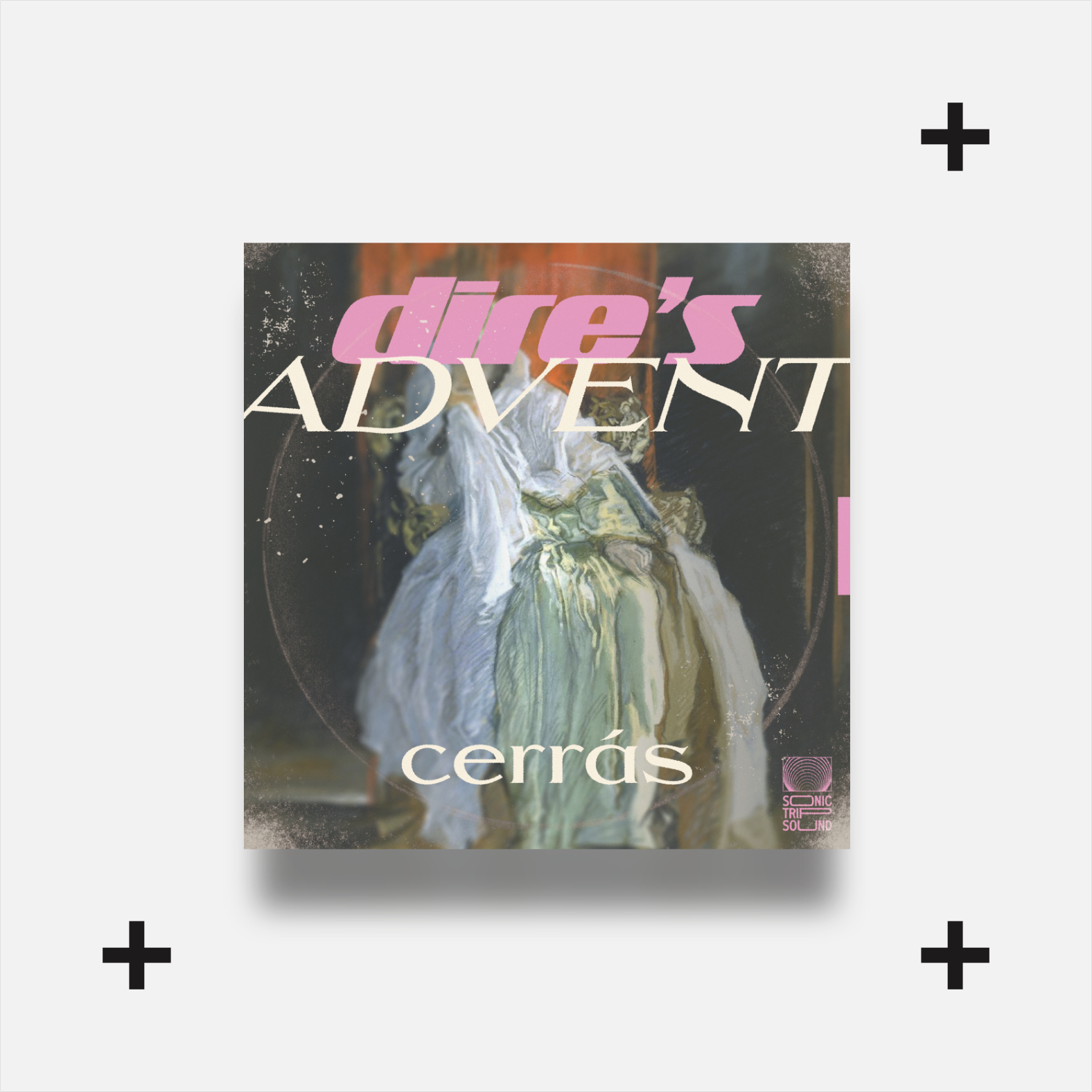
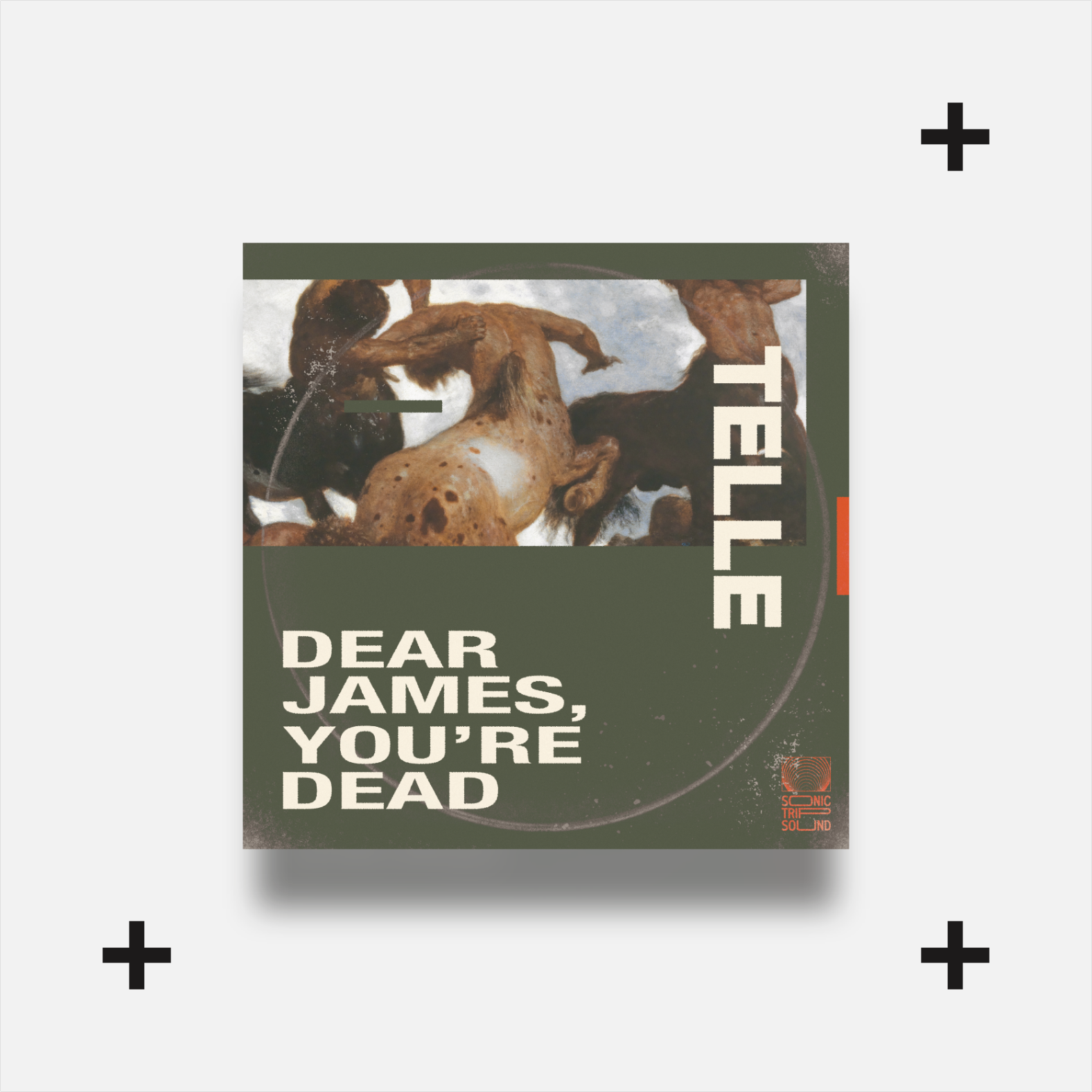
Now that the logo tied more closely into what Sonic Trip Sound stood for as a brand, both in name and symbology, I had a solid base for a Identity System. From there I wanted to expand the palette to match the next batch of album covers that I had planned out.
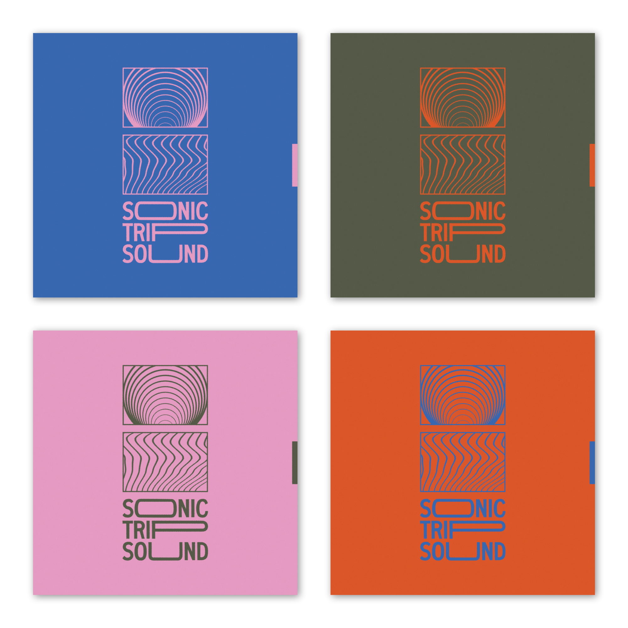
Once the palette was determined, Sonic Trip Sounds’ branding was complete and integration into the product line was smooth and could be easily incorporated into new designs.